The Waiting Room, the Lobby and the Service Counter
Understand how a waiting room, lobby and service counter guide different public journeys, so you can spot unclear routes and improve the next visitor’s experience.
Where should you go when you enter a public building, and how can you tell whether the room is arranged to help you? A waiting room, lobby and service counter each support a different part of a visit, even when they share one space. Their layout can make the next action clear—or leave visitors guessing.
These places are not interchangeable. One supports staying, another helps people arrive and orient themselves, and a third brings a person into direct contact with a service. Looking at what people are expected to do, where they pause and what they can see offers a useful way to judge whether the layout fits its task.
Three kinds of room
A waiting room is organised around time spent waiting. It may sit outside a clinic, advice office or licensing service, with chairs facing a reception point or arranged around the edges. The basic promise is that a visitor can pause without blocking arrivals or needing to know the next step straight away.
A lobby is organised around movement and orientation. People enter, meet someone, find a stair or lift, read a directory, or decide which part of the building to approach. A lobby can include seats, but seating alone does not make it a waiting room. Its central task is to help different journeys begin and continue.
A service counter is organised around an exchange. A visitor approaches with a question, document or request; a staff member responds, and the visitor either leaves or moves on to another stage. The counter may be a window, reception desk, shared table or marked point within a larger room. What matters is that the place to ask is apparent and that the exchange has enough privacy and space for its purpose.
Buildings often combine these functions, especially where space is limited. The test is not whether each has a separate room, but whether a person can tell what to do without interrupting someone else’s business.
Layouts for different jobs
In a waiting room, comfort and orderly waiting matter more than a dramatic entrance. Seats should be easy to recognise as available, and routes through the room should remain clear. A visible display or staff point can tell visitors when to act. If names or personal details are called aloud, the arrangement also affects how much other people can hear.
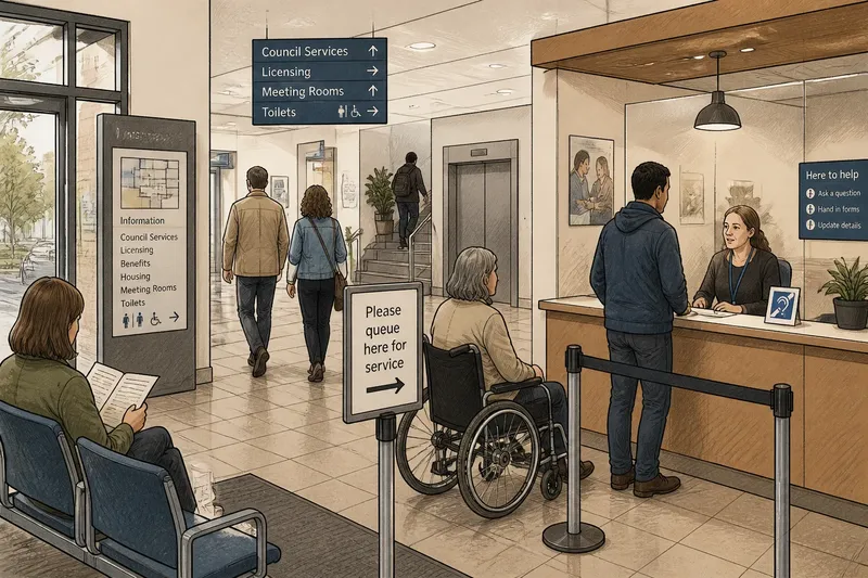
The room should not imply that everyone can sit and wait in the same way. Someone using a mobility aid may need space to manoeuvre and a seat nearby for a companion. A person who cannot read a small screen may depend on audible announcements or a staff member who can explain what happens next. Clear signage and more than one way to receive an instruction help make waiting usable for more people.
A lobby has a different problem: its users may not yet know where they belong. A directory, floor plan, reception point and visible routes can work together, provided they do not compete for attention. Signs are most useful when they answer a decision where it arises. A directory beside the entrance helps with choosing a destination; a small sign beside a corridor can confirm the turn.
The service counter needs a clear approach and a clear stopping point. Visitors should be able to recognise where to queue, where to speak and where to wait for a response. A high desk may suit a standing conversation but create difficulty for a seated visitor. A lower section or an alternative nearby place to speak can make the exchange less dependent on one body position.
Privacy belongs to the design too. A counter handling forms or personal questions should not force visitors to display paperwork to people passing behind them. Space between the conversation and the next person in line can help, while a separate room or quieter point may suit a sensitive matter. The right arrangement depends on the service and its requirements.
Reading the layout
To assess a shared indoor space, follow a visitor’s route in sequence: entrance, first decision, pause or queue, interaction, and exit. At each point, ask what the person can see, what they are expected to do, and whether someone else’s activity makes that action harder. This is not an audit of appearance. It is a way to compare the room’s signals with the task it is meant to support.
- At the entrance: Check whether a first-time visitor can see reception, a queue marker or a directory. If the next action is clear, keep the arrangement; if not, add or reposition a sign pointing to the right starting point.
- At the first decision: Check whether signs appear before a visitor must choose a direction. If they do, keep them; if they appear only after the turning point, move or add a sign where the choice occurs.
- At the pause: Check whether there is an obvious place to wait that does not obstruct a desk, lift or doorway. If the waiting area is distinct and the route remains open, retain it; if not, move seating or mark a separate waiting point.
- At the exchange: Check whether visitors can tell where to stand or sit and whether others can overhear or see sensitive details. If the exchange is clear and suitably private, keep the position; if not, create a quieter alternative or adjust the queue.
- At the transition: Check whether visitors know what to do after speaking to staff, such as returning to a seat or going to another office. If the next action is visible, retain the cue; if not, add a spoken instruction or sign at the counter.
- Along the route: Check whether furniture, doors or queues narrow the way to the service. If the route is open, leave it as arranged; if it is blocked, move the obstruction and make the intended route more legible.
These checks reveal mismatches. A line that stretches across the main entrance may suggest that the counter is hard to find or that the queue has no clear beginning. A directory hidden behind waiting chairs may technically be present but practically unavailable. A bare lobby with no visible welcome point may leave visitors unsure whether they have entered the right door.
Say a council service centre has a directory beside the entrance, a form-submission counter around a corner and an unmarked queue beside the door. A visitor arrives carrying a form and sees no instruction about where to hand it in. First, they read the directory but find no clear route to the counter; next, they notice the queue but cannot tell whether it is for forms or appointments; finally, they pause near the doorway, where they obstruct arrivals. The practical answer is to mark the queue beside the counter and add a sign at the entrance. The expected observable result is that a new visitor can identify the form queue before stopping in the doorway; if the sign still leaves the queue’s purpose unclear, staff need a more specific label or a separate line.
Choosing an arrangement
The best arrangement depends on what most visitors need to do there. A clinic with appointments may need a defined waiting area and a separate reception exchange. A large public building may need a generous lobby because people arrive for unrelated services. A compact office may combine reception and a counter, but should still make clear where a visitor waits after asking a question.
Consider the most common journey first, then notice less obvious ones: someone arriving without an appointment, carrying papers, accompanying another person, or needing help before choosing a queue. These are not details to tuck away. They show whether the space’s instructions work for people who arrive with different needs.
Materials and furnishings can reinforce a room’s role without elaborate signs. A durable floor finish may mark a route through a lobby; chairs grouped away from a counter can signal a waiting area; a modest change in desk height can make a service point more approachable. Like labels on drawers, these cues help only when they match what is actually inside: a seat that appears to belong to a waiting area is misleading if visitors are expected to queue there instead.
When a layout seems unclear, change the question from “Does this room look welcoming?” to “What action does it invite, and is that the action the service needs?” A pleasant room can still make people hesitate, while a plain one can be easy to use. The waiting room, lobby and service counter are clearest when their furniture, routes and signs all tell the same story.
Questions about public rooms?
What is the difference between a lobby and a waiting room?
A lobby helps people enter, orient themselves and move towards a destination. A waiting room is chiefly for people who have reached the right service and need to pause.
Should a service counter be inside the lobby?
It can be, especially where visitors need quick directions or simple transactions. If conversations involve private information, the counter may need a quieter position or a separate place for longer exchanges.
How can I tell whether a public room is confusing?
Follow the route from the entrance and look for moments when a visitor must guess where to go, where to wait or what happens next. A repeated pause at a doorway or an uncertain queue suggests that the room’s cues may not match its purpose.
What should a building improve first?
Start where uncertainty interferes most with the intended task, such as an unclear queue entrance or a directory that cannot be seen on arrival. A well-placed sign or clearer route may help more than adding signs throughout the building.
For a visitor, the difference between these spaces is practical: where to pause, where to ask and how to continue. A public indoor layout is doing its job when those choices are visible without making people rely on someone else to explain the room. To judge a waiting room, lobby or service counter, follow the action it invites and check whether the next action is clear.